
From tour merch to corporate uniforms — we make it happen, on time, every time.
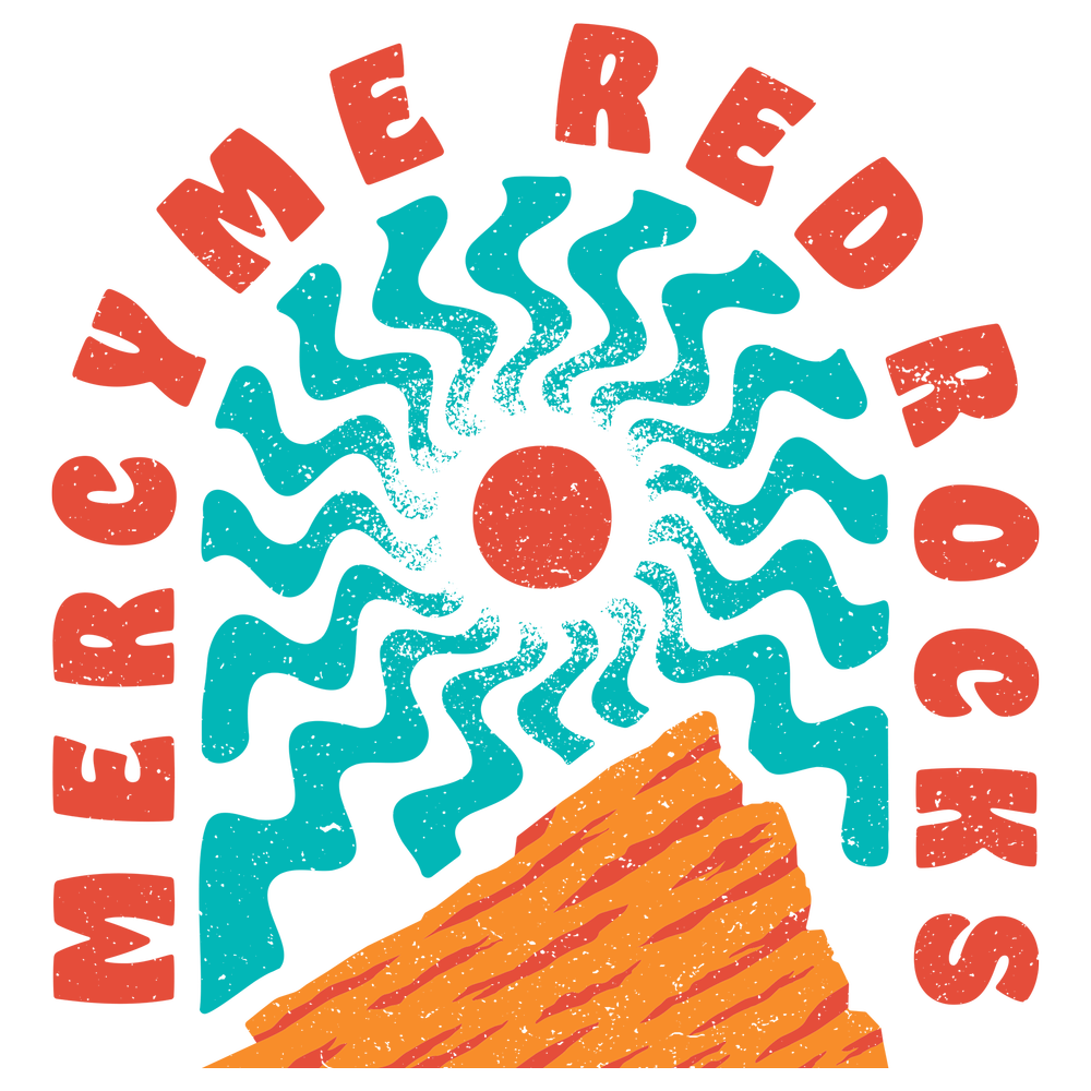
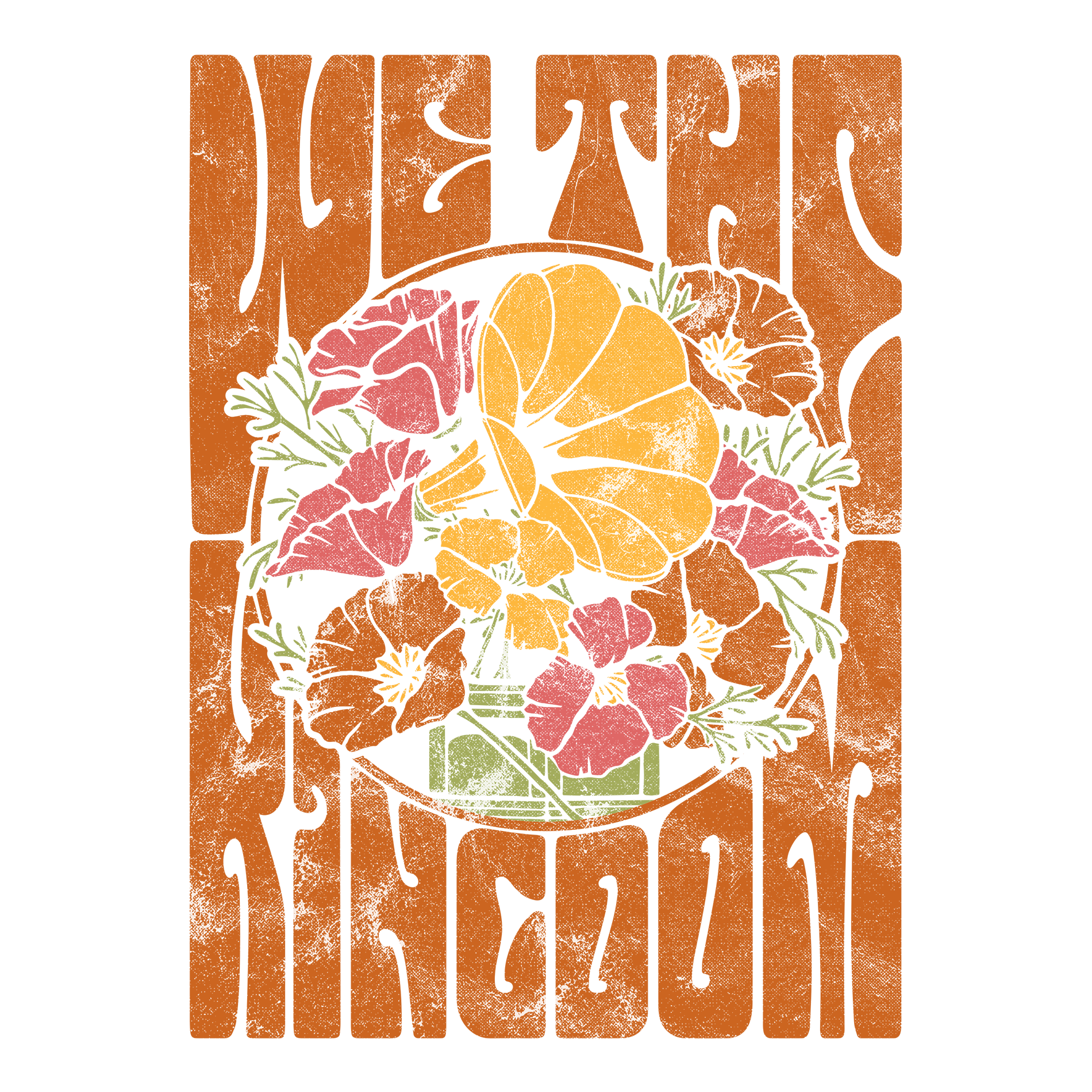
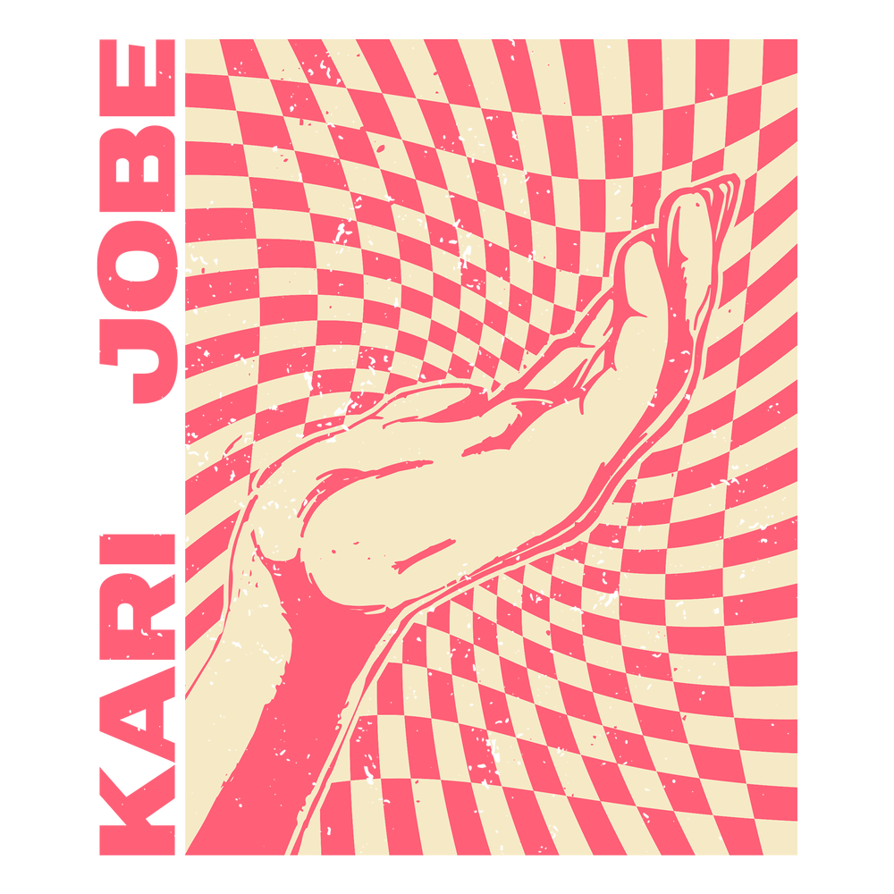
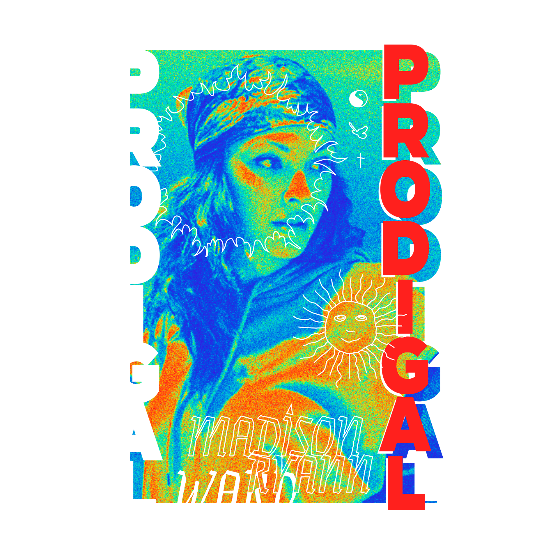
From small nonprofits to nationally touring artists — here's a look at what we've been building.
Our in-house design team works with a wide range of clients, each with different needs and audiences. These are just a few of our favorites.
Every design starts with a conversation. We know better than anyone that your voice is unique.
We take pride in creating high quality designs that match the distinct personalities of each of our collaborators.
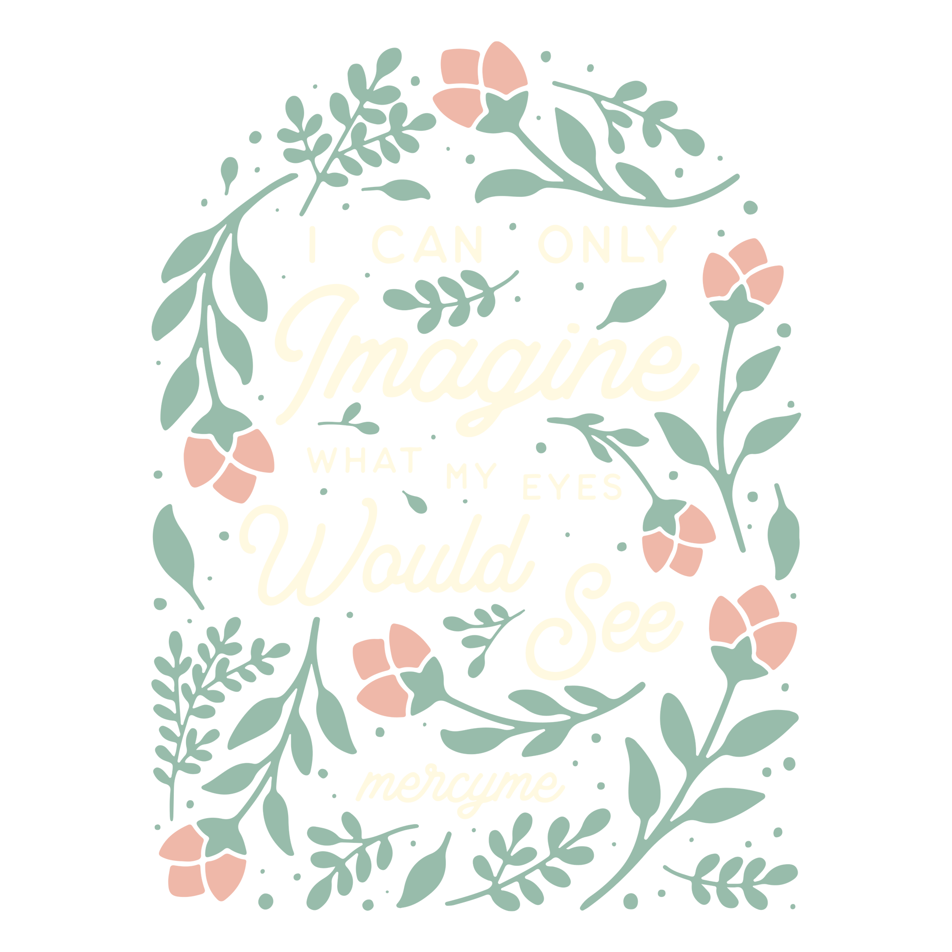
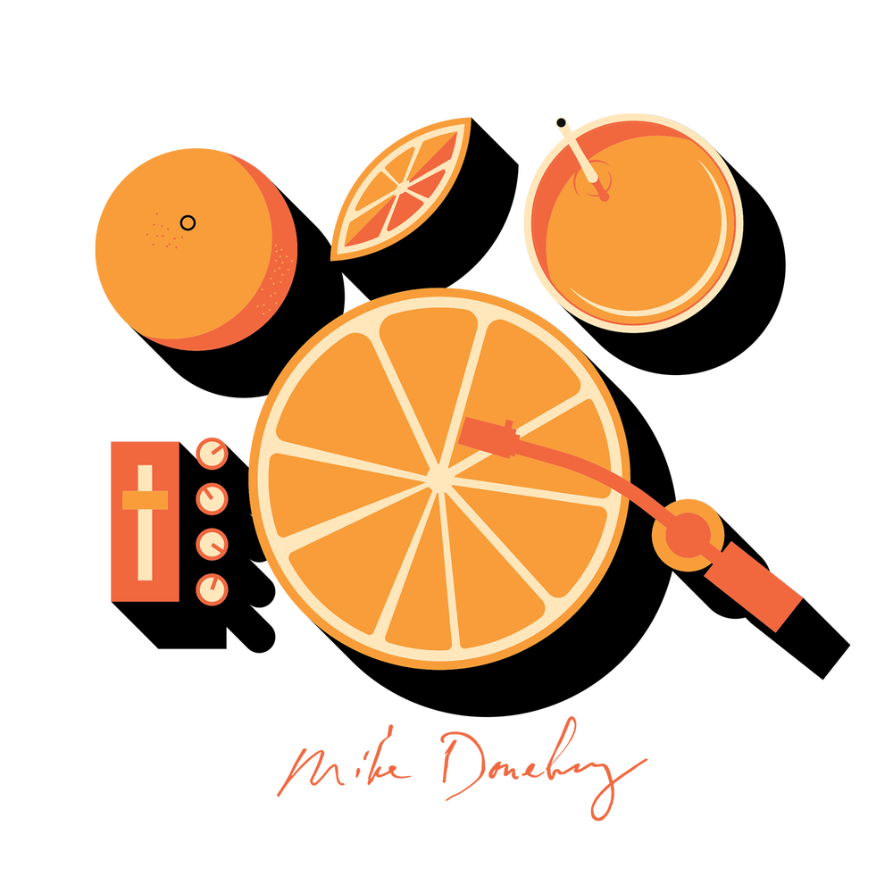
We’ve been trusted by up-and-coming musicians and industry leaders alike.


